
Web Design
CAMPAIGNS:
Our Rhythm, Our Dream
Halloween 2020
Male Enthusiasts
Halloween 2021
Editorial Web Page for Highlighted Launch Titles
Evolving Web Design Through Iteration & Motion
The evolution of HBO Max's brand, marked by a transition from a colorful icon to a sophisticated dark purple scheme, reflects a strategic shift towards conveying professionalism and authority while maintaining visual clarity. Throughout this journey, I played a pivotal role in shaping the brand's visual direction, introducing innovative design elements such as a split-screen format to highlight key titles, directed animation and effectively showcase the breadth of content offerings. This strategic approach yielded significant results, with the redesigned interface driving a notable 40% increase in viewership and subscriptions, solidifying HBO Max's position as a leading player in the streaming industry. Looking ahead, we remain committed to refining our design strategies to ensure continued engagement and success in an ever-evolving landscape.
Our Rhythm, Our Dream
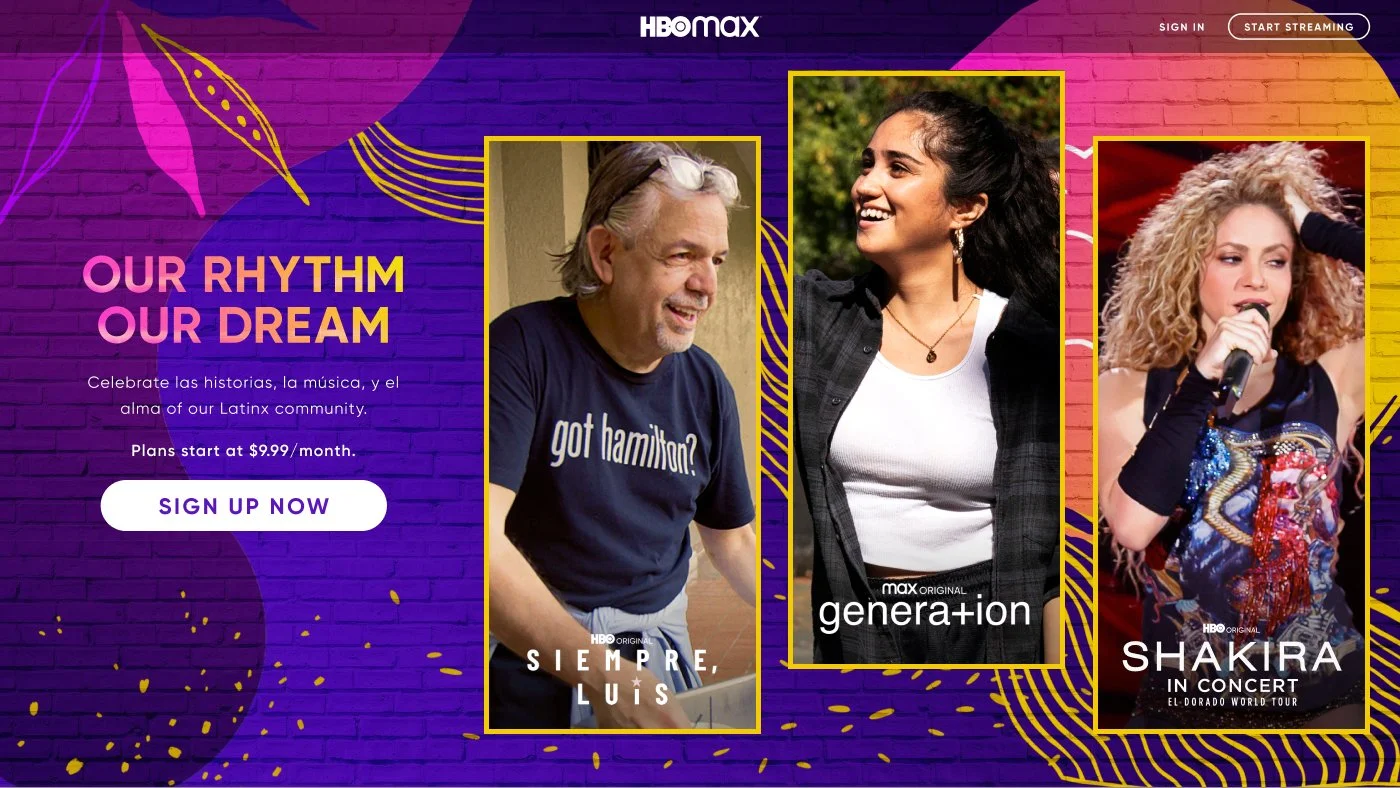
I spearheaded the visual design for the Latin X campaign celebrating the release of "In the Heights." This project was a pivotal moment in HBO Max's web design history. I split the hero section into three featured titles instead of one, showcasing three key titles simultaneously across web and in-app surfaces. This was the first time HBO Max moved beyond a single title hero, expanding content discovery for customers. I curated a color palette inspired by food, music, and dance, then designed the collection tiles, an app page, and a responsive microsite. The system was built to scale across future campaigns.

The Result
The campaign drove a 36% increase in viewership for featured titles. The three title format became a reusable pattern applied to subsequent 360 Campaign launches.
Targeted Keywords: Content discovery, scalable system, responsive design, cross surface execution
Halloween 2020 Campaign
I designed the visual identity for Halloween 2020, including the six title animated hero and themed collection tiles. The campaign leaned into darker, moodier colors and horror focused key art. This was the first test of the expanded hero format. I built the assets using a component based system in Figma, allowing the team to swap titles and copy quickly without rebuilding from scratch.
The campaign performed well, but the six title format showed early signs of cognitive overload. This data informed the decision to refine the approach in future campaigns.
Targeted Keywords: Component based system, Figma efficiency, data informed iteration
Male Enthusiasts Page
This campaign pushed the hero format further, expanding from three titles to six animated titles. I directed the creation of GIF heroes that rotated through key content, bringing motion and cinematic energy to the product experience. The goal was to test whether more variety would drive deeper engagement. I collaborated with animators to create the motion assets and ensured they performed across web, mobile, and TV.
The Result
Six titles proved to be too distracting for customers. The team learned to prioritize clarity over quantity, and future campaigns returned to the three title format. This iterative testing shaped HBO Max's hero strategy going forward.
Targeted Keywords: Motion direction, cinematic UX, cross platform performance, iterative testing
Halloween 2021 Campaign
I collaborated with a team of three designers, an animator, and a full-stack designer to create a campaign based on the concept of picture frames leading into new dimensions. Each frame carried a story, inviting customers into an entirely new world. We wanted to capture the feeling of walking through a haunted mansion with a fun house of mirrors.
We illustrated our own patterns, ripped wallpaper textures to add dimension and history to the walls, and hung misaligned frames that highlighted three featured titles selected by the strategy team. The image on the left is an animation test created to showcase our vision for an animated hero webpage to the VP of Design.
Drawing inspiration from the movie "IT," we also developed a three-door concept. In the film, the main character must choose one of three doors to escape the monster. We adapted this idea into an in-app feature that lets customers choose from three portals, each representing a different level of scariness. The feature organized horror content by intensity, clearly distinguishing what was appropriate for kids and what was not.
After learning from the 2020 campaign, I narrowed the hero back to three titles. The visual direction shifted to a cleaner, more focused layout with clearer hierarchy. The animated elements were simplified to reduce distraction while maintaining visual interest. The three-title format became the standardized template for all future campaigns.
We we’re testing this animation out before we launched this for the public.


You may click on the images above to explore each concept in detail.
The Result
The three title format became the new standard for HBO Max campaigns, balancing content discovery with customer focus. The template was reused across 10 subsequent campaigns, reducing production time by 30 percent.
Targeted Keywords: Standardized template, production efficiency, balanced discovery and focus
Editorial Web Design
I designed editorial pages for major title launches, including "The Last of Us" and "The Nevers." Each page functioned like a mini IMDB experience within HBO Max, featuring a hero with key art, a banner promoting pricing starting at 9.99, a trailer or excerpt with launch date, main character bios and role descriptions, behind-the-scenes footage exclusive to HBO Max, and a breadth of other genre content at the bottom to drive further engagement.
For "The Last of Us," I conducted research and developed high-fidelity prototypes and content variations. Through iterative design, I refined a web layout optimized to immerse users in the storyline, driving engagement with the highlighted content and the newly released title.
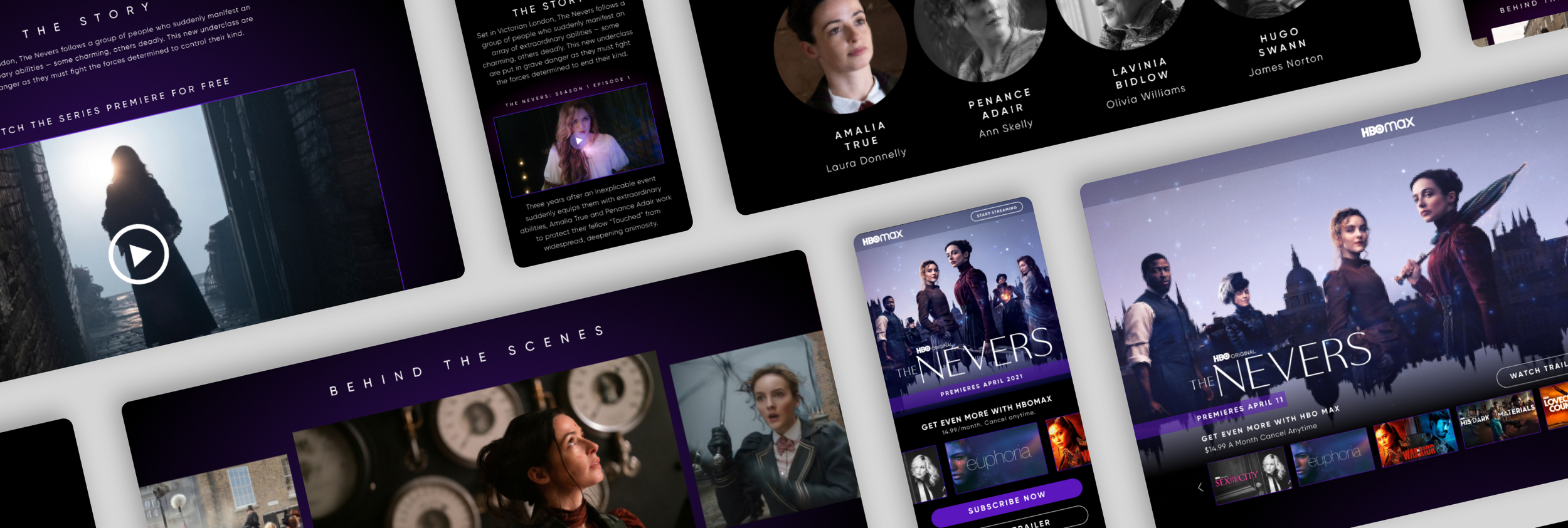



Here is a responsive design web page for my favorite show and game, Last of Us.
You may select the images below to view the design in full screen.


The page structure was built to be modular, allowing content teams to mix and match components for each new launch. The format was reused across more than 15 title launches and is still used today, creating a consistent, scalable content experience that has outlasted my time at the company.
Targeted Keywords: Modular design system, scalable content experience, deeper engagement, reusable components