| Unveiling the Aisle: Redesigning a User-Friendly Product Shopping Experience |
Build-A-Bear is a unique toy workshop where loved ones can create personalized stuffed animals to curate their best memories, which will be cherished forever. This workshop offers an array of options, from intricate details such as unique recordings of loved ones to curated dressed stuffed animals that create a fun and interactive experience for all ages. Build-A-Bear approached us requesting a responsive website redesign to enhance their navigation experience and product organization.
After amassing a wide range of products over time, their primary hurdle was organizing all their content into a unified homepage, which entailed integrating new colors and a fresh logo. Upon reviewing their website, I observed that each product occupied an entire page, resulting in excessive scrolling and potentially testing the patience of visitors navigating the site. Streamlining the layout and condensing product presentations could significantly enhance the browsing experience for customers.
Client’s Original Pages
Upon review, I observed that their homepage is excessively long, with each product occupying the entire browser window, resulting in a cumbersome scrolling experience. Additionally, their About Us page lacked vibrancy and failed to reflect their brand essence effectively. The presence of unnecessary nested boxes further detracted from the page's visual appeal, and it could benefit from refinement to better align with its brand identity.
( You could select the images below to see the full page )
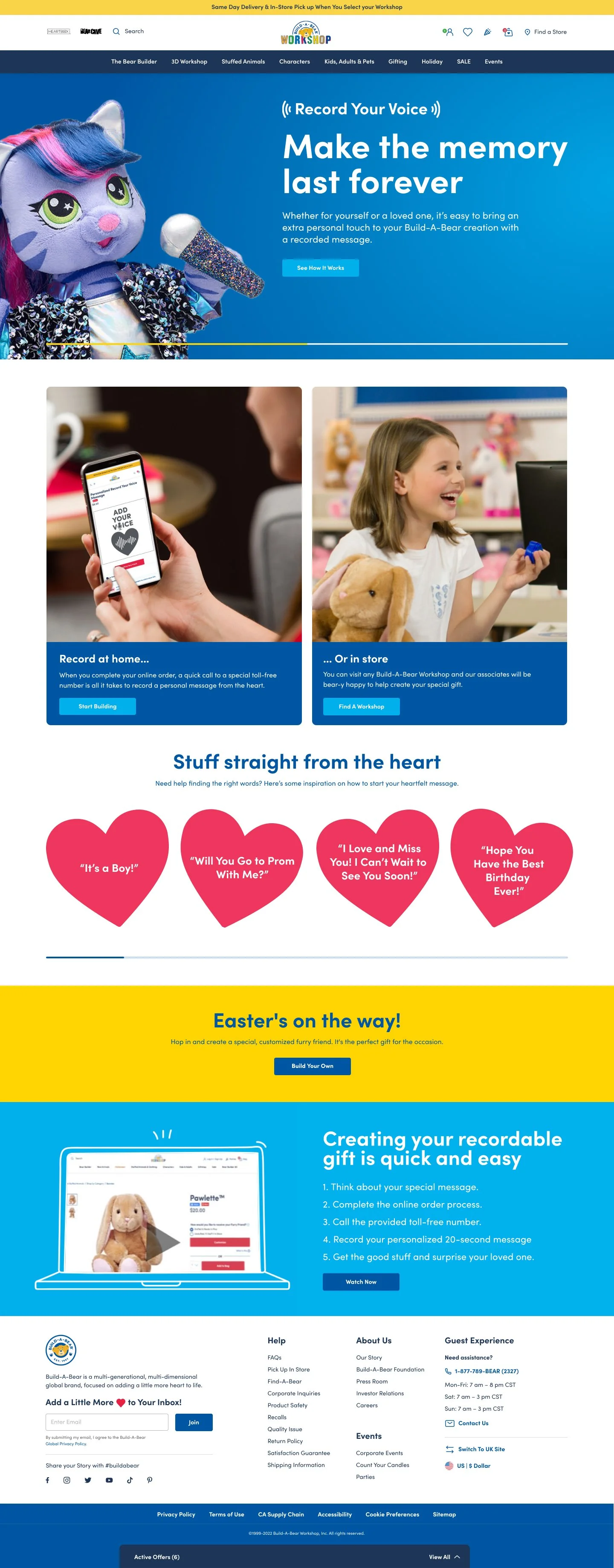
Redesigned Homepage
In redesigning their website, we streamlined the homepage layout to reduce excessive scrolling by optimizing space utilization within the header. I addressed redundant logo placement, ensuring consistency by featuring only one logo throughout the page. We have made some changes to the website layout, adding a dark blue bar to create a contrast between the navigation area located at the top of the page below the logo. Additionally, we have restructured the product categories to make them more organized and accessible for our users. Then, we consolidated holiday-themed sections into dedicated containers, grouping each theme together for cohesive visual presentation and improved navigation. Lastly, the client wanted to keep their product navigation of plush toys at the top of the page to avoid confusion for their viewers. We were still conceiving ideas of simplifying their homepage, which are still mockups of each component.
Redesigned ABout Us Page
In this section, I infused the page with an array of their vibrant brand colors, injecting personality and visual appeal. I strategically incorporated essential elements such as their mission statement, a comprehensive list of brand values, and the foundations they support, fostering a deeper connection with their audience. Users are seamlessly directed to a designated link for further exploration. Moreover, a glimpse into the brand's rich history and the latest news on Build-A-Bear releases or highlights adds depth to the user experience. A dedicated space introducing the team behind the brand fosters transparency and trust, while a thoughtfully curated careers section invites talent to join their journey.


